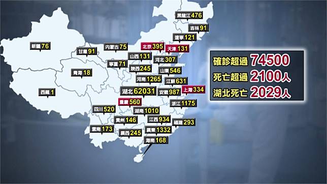
 今年2020剛開始便被這個來自2019年傳出的2019n-Cov(俗稱的武漢肺炎病毒)鬧的人心惶惶,而在我們偉大的中國共產黨領導下,疫情也是如雨後春筍般的在中國甚至鄰近國家散播,而前陣子有個同學在偉大中國共產黨疫情通報網(link: http://www.nhc.gov.cn/xcs/yqtb/list_gzbd.shtml) 上,將疫情人數的數量做成表,並用excel繪製了一個簡單的圖表以及用Benford’s law檢查了資料是否有造假的可能,但因疫情假期還很長,因此變跟他要了這個(基本上是造假的)data,想說跑一些簡單的資料探勘看看會不會有有趣的結果。
1. 資料探勘
讀取資料
import pandas as pd
import numpy as np

df = pd.read_csv('C:/Users/User/OneDrive - student.nsysu.edu.tw/Documents/Python/ML/2019nCov/2019nCov.csv')
計算每日成長人數
成長人數 = [0]
for i in range(len(df)-1):
    成長人數 += [df['確診'][i+1]-df['確診'][i]]
df['確診成長人數'] = 成長人數
df| 日期 | 確診 | 死亡 | 治癒 | 確診成長率 | 死亡率 | 治癒率 | 確診成長人數 | |
|---|---|---|---|---|---|---|---|---|
| 0 | 1月11日 | 41 | 1 | 2 | NaN | 0.024390 | 0.048780 | 0 |
| 1 | 1月12日 | 41 | 1 | 6 | 0.000000 | 0.024390 | 0.146341 | 0 |
| 2 | 1月13日 | 41 | 1 | 7 | 0.000000 | 0.024390 | 0.170732 | 0 |
| 3 | 1月14日 | 41 | 1 | 7 | 0.000000 | 0.024390 | 0.170732 | 0 |
| 4 | 1月15日 | 41 | 1 | 7 | 0.000000 | 0.024390 | 0.170732 | 0 |
| 5 | 1月16日 | 41 | 2 | 12 | 0.000000 | 0.048780 | 0.292683 | 0 |
| 6 | 1月17日 | 45 | 2 | 15 | 0.097561 | 0.044444 | 0.333333 | 4 |
| 7 | 1月18日 | 62 | 2 | 19 | 0.377778 | 0.032258 | 0.306452 | 17 |
| 8 | 1月19日 | 121 | 3 | 24 | 0.951613 | 0.024793 | 0.198347 | 59 |
| 9 | 1月20日 | 198 | 3 | 25 | 0.636364 | 0.015152 | 0.126263 | 77 |
| 10 | 1月21日 | 291 | 3 | 25 | 0.469697 | 0.010309 | 0.085911 | 93 |
| 11 | 1月22日 | 440 | 9 | 25 | 0.512027 | 0.020455 | 0.056818 | 149 |
| 12 | 1月23日 | 571 | 17 | 25 | 0.297727 | 0.029772 | 0.043783 | 131 |
| 13 | 1月24日 | 830 | 25 | 34 | 0.453590 | 0.030120 | 0.040964 | 259 |
| 14 | 1月25日 | 1287 | 41 | 38 | 0.550602 | 0.031857 | 0.029526 | 457 |
| 15 | 1月26日 | 1975 | 56 | 49 | 0.534577 | 0.028354 | 0.024810 | 688 |
| 16 | 1月27日 | 2744 | 80 | 51 | 0.389367 | 0.029155 | 0.018586 | 769 |
| 17 | 1月28日 | 4515 | 106 | 60 | 0.645408 | 0.023477 | 0.013289 | 1771 |
| 18 | 1月29日 | 5974 | 132 | 103 | 0.323145 | 0.022096 | 0.017241 | 1459 |
| 19 | 1月30日 | 7711 | 170 | 124 | 0.290760 | 0.022046 | 0.016081 | 1737 |
| 20 | 1月31日 | 9692 | 213 | 171 | 0.256906 | 0.021977 | 0.017643 | 1981 |
| 21 | 2月1日 | 11791 | 259 | 243 | 0.216570 | 0.021966 | 0.020609 | 2099 |
| 22 | 2月2日 | 14380 | 304 | 328 | 0.219574 | 0.021140 | 0.022809 | 2589 |
| 23 | 2月3日 | 17205 | 361 | 475 | 0.196453 | 0.020982 | 0.027608 | 2825 |
| 24 | 2月4日 | 20438 | 425 | 632 | 0.187910 | 0.020795 | 0.030923 | 3233 |
| 25 | 2月5日 | 24324 | 490 | 892 | 0.190136 | 0.020145 | 0.036672 | 3886 |
| 26 | 2月6日 | 28018 | 563 | 1153 | 0.151866 | 0.020094 | 0.041152 | 3694 |
| 27 | 2月7日 | 31161 | 636 | 1540 | 0.112178 | 0.020410 | 0.049421 | 3143 |
| 28 | 2月8日 | 34546 | 722 | 2050 | 0.108629 | 0.020900 | 0.059341 | 3385 |
| 29 | 2月9日 | 37198 | 811 | 2649 | 0.076767 | 0.021802 | 0.071214 | 2652 |
| 30 | 2月10日 | 40171 | 903 | 3281 | 0.079924 | 0.022479 | 0.081676 | 2973 |
| 31 | 2月11日 | 42638 | 1016 | 3996 | 0.061412 | 0.023829 | 0.093719 | 2467 |
| 32 | 2月12日 | 44653 | 1113 | 4740 | 0.047258 | 0.024926 | 0.106152 | 2015 |
| 33 | 2月13日 | 59868 | 1367 | 5911 | 0.340739 | 0.022834 | 0.098734 | 15215 |
畫每日確診人數圖
import matplotlib.pyplot as plt
x = df.iloc[:,1:2]

plt.plot(x)
plt.xlabel("Date")
plt.ylabel("Number of people")
plt.title("Wuhan Pneumonia Cumulative Amount Plot")

plt.show()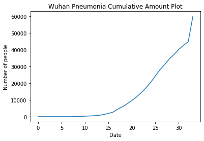
畫每日肺炎成長率
y = df.iloc[:,4:5]

plt.plot(y)
plt.xlabel("Date")
plt.ylabel("Infected Growth Rate")
plt.title("Wuhan Pneumonia Growth Rate Plot")

plt.show()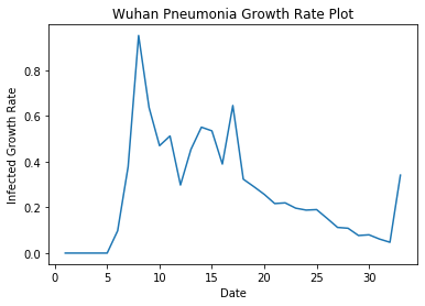
計算各項平均數值
print('平均確診成長率:',np.mean(df['確診成長率']))
print('平均死亡率:',np.mean(df['死亡率']))
print('平均治癒率:',np.mean(df['治癒率']))
print('平均確診成長人數:',np.mean(df['確診成長人數']))
平均確診成長率: 0.2659557775454546
平均死亡率: 0.024685260176470585
平均治癒率: 0.09026695652941175
平均確診成長人數: 1759.6176470588234
從數據上來看,死亡率確實很精準地落在百分之二左右,而成長人數因中共的確診方式在2/13時宣稱,因序列檢驗耗時太久,因此只要符合病徵以及MRI確認肺部有發炎症狀即確診,因此人數突然飆升。
2. The SIR epidemic model
一年級有在統計模擬課程上稍微使用過SIR Model,因此這次利用前面的平均數,建立簡單的模擬模型,模擬感染平均狀況的每日人數變化。
這裡僅利用武漢的人口總數計算,因應中國當局以城市當作封閉單位,因此以一個單位內部傳染情況來做推算。
因此利用:
總人口數:\(N\) = 10000000、
平均移除率(平均死亡率+平均治癒率):\(\gamma\) = 0.024685260176470585+0.09026695652941175 = 0.11495221670588233
假設感染接觸率:\(\beta\) = 0.9、0.6、0.25
這裡假設幾種感染接觸率,這裡的接觸率我們假設三種情況,人口正常移動且無防護意識:0.9、人口減少移動且少部分有防疫意識:0.6、人口低流動且盡可能不接觸可能的感染者:0.25。
Type 1:人口正常移動且無防護意識
import numpy as np
from scipy.integrate import odeint
import matplotlib.pyplot as plt

# Total population, N.
N = 100000000
# Initial number of infected and recovered individuals, I0 and R0.
I0, R0 = 1, 0
# Everyone else, S0, is susceptible to infection initially.
S0 = N - I0 - R0
# Contact rate, beta, and mean recovery rate, gamma, (in 1/days).
beta, gamma = 0.9, 0.11495221670588233
# A grid of time points (in days)
t = np.linspace(0, 160, 160)

# The SIR model differential equations.
def deriv(y, t, N, beta, gamma):
    S, I, R = y
    dSdt = -beta * S * I / N
    dIdt = beta * S * I / N - gamma * I
    dRdt = gamma * I
    return dSdt, dIdt, dRdt

# Initial conditions vector
y0 = S0, I0, R0
# Integrate the SIR equations over the time grid, t.
ret = odeint(deriv, y0, t, args=(N, beta, gamma))
S, I, R = ret.T

# Plot the data on three separate curves for S(t), I(t) and R(t)
fig = plt.figure(facecolor='w')
ax = fig.add_subplot(111)
ax.plot(t, S/100000000, 'b', alpha=0.5, lw=2, label='Susceptible')
ax.plot(t, I/100000000, 'r', alpha=0.5, lw=2, label='Infected')
ax.plot(t, R/100000000, 'g', alpha=0.5, lw=2, label='Recovered with immunity')
ax.set_xlabel('Time /days')
ax.set_ylabel('Number (10000000s)')
#ax.set_ylim(0,1.2)
ax.yaxis.set_tick_params(length=0)
ax.xaxis.set_tick_params(length=0)
ax.grid(b=True, which='major', c='w', lw=2, ls='-')
legend = ax.legend()
legend.get_frame().set_alpha(0.5)
for spine in ('top', 'right', 'bottom', 'left'):
    ax.spines[spine].set_visible(False)
plt.show()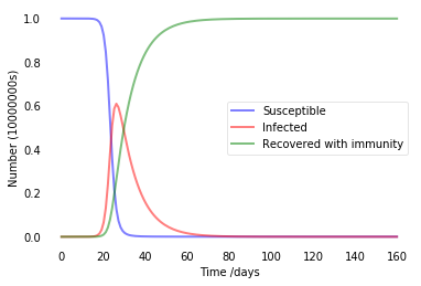
從上圖表可以看出,若對此病毒無任何作為時,可以在近一個月的時間將整個城市的人全面感染。
Type 2:人口減少移動且少部分有防疫意識
beta = 0.5
# Integrate the SIR equations over the time grid, t.
ret = odeint(deriv, y0, t, args=(N, beta, gamma))
S, I, R = ret.T
# Plot the data on three separate curves for S(t), I(t) and R(t)
fig = plt.figure(facecolor='w')
ax = fig.add_subplot(111)
ax.plot(t, S/100000000, 'b', alpha=0.5, lw=2, label='Susceptible')
ax.plot(t, I/100000000, 'r', alpha=0.5, lw=2, label='Infected')
ax.plot(t, R/100000000, 'g', alpha=0.5, lw=2, label='Recovered with immunity')
ax.set_xlabel('Time /days')
ax.set_ylabel('Number (10000000s)')
#ax.set_ylim(0,1.2)
ax.yaxis.set_tick_params(length=0)
ax.xaxis.set_tick_params(length=0)
ax.grid(b=True, which='major', c='w', lw=2, ls='-')
legend = ax.legend()
legend.get_frame().set_alpha(0.5)
for spine in ('top', 'right', 'bottom', 'left'):
    ax.spines[spine].set_visible(False)
plt.show()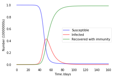
在減少人口流動後,全面感染的時間將被拉長至兩個月,將有助於爭取疫苗或是特效藥的研發時間。
Type 3:人口低流動且盡可能不接觸可能的感染者
beta = 0.25
# Integrate the SIR equations over the time grid, t.
ret = odeint(deriv, y0, t, args=(N, beta, gamma))
S, I, R = ret.T
# Plot the data on three separate curves for S(t), I(t) and R(t)
fig = plt.figure(facecolor='w')
ax = fig.add_subplot(111)
ax.plot(t, S/100000000, 'b', alpha=0.5, lw=2, label='Susceptible')
ax.plot(t, I/100000000, 'r', alpha=0.5, lw=2, label='Infected')
ax.plot(t, R/100000000, 'g', alpha=0.5, lw=2, label='Recovered with immunity')
ax.set_xlabel('Time /days')
ax.set_ylabel('Number (10000000s)')
#ax.set_ylim(0,1.2)
ax.yaxis.set_tick_params(length=0)
ax.xaxis.set_tick_params(length=0)
ax.grid(b=True, which='major', c='w', lw=2, ls='-')
legend = ax.legend()
legend.get_frame().set_alpha(0.5)
for spine in ('top', 'right', 'bottom', 'left'):
    ax.spines[spine].set_visible(False)
plt.show()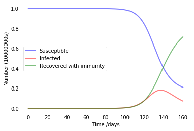
在具備有良好的全面控制下,將可有效的避免病毒的傳播 ,因此若要減緩甚至是阻止病毒的傳播,減少人口的接觸率將會是最直接最簡單的方式。
3. Benford’s Law
這裡我們來檢查一下偉大黨提供的數據是否有造假的疑慮,以下是excle上面執行的結果截圖:
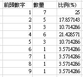
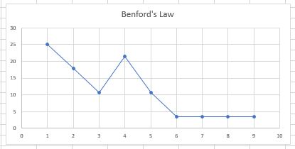
數字4出現的次數顯得有點突出,若是數據造假,落在數字4難道真的巧合嗎?不,我不這麼認為。
人口清洗的陰謀論、數字6之後出現的次數也相同,難道這是防疫中心想要表達64 64的訊息給廣大的萬萬子民嗎?

總之,希望這次疫情能夠順利結束,大家也能夠配合政府政策,減緩並阻止病毒的擴張,Peace!